Package Design
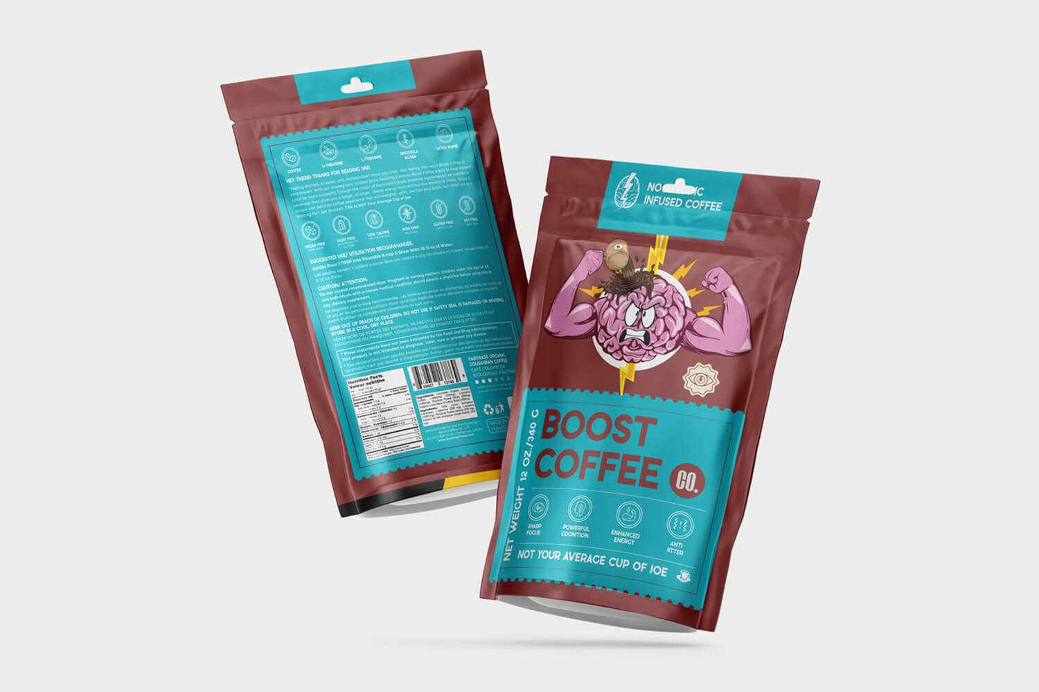
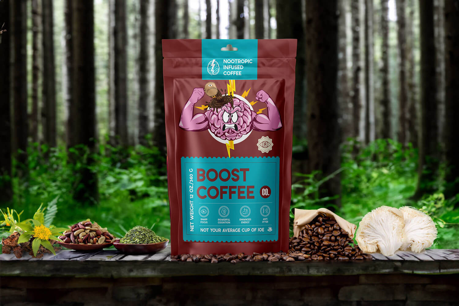
The package design process for Boost Coffee was driven by the need to clearly convey the product’s unique selling point—a coffee that boosts brainpower while being gentle on the body. After extensive discussions about the brand’s message, we determined that the packaging needed to visually represent the idea of cognitive enhancement.
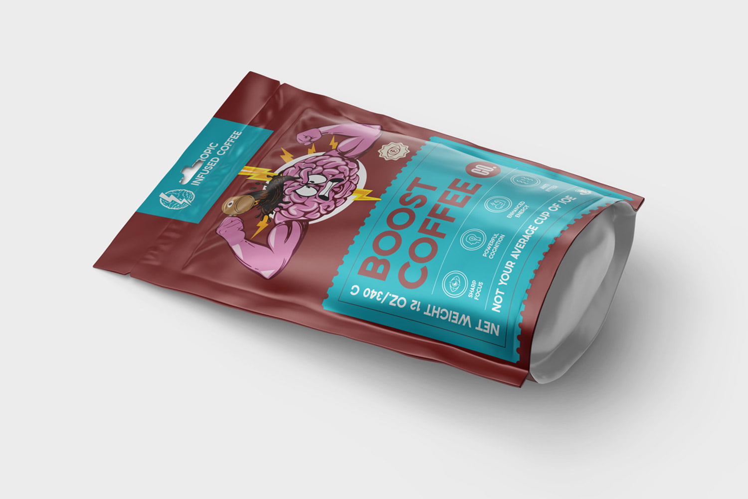
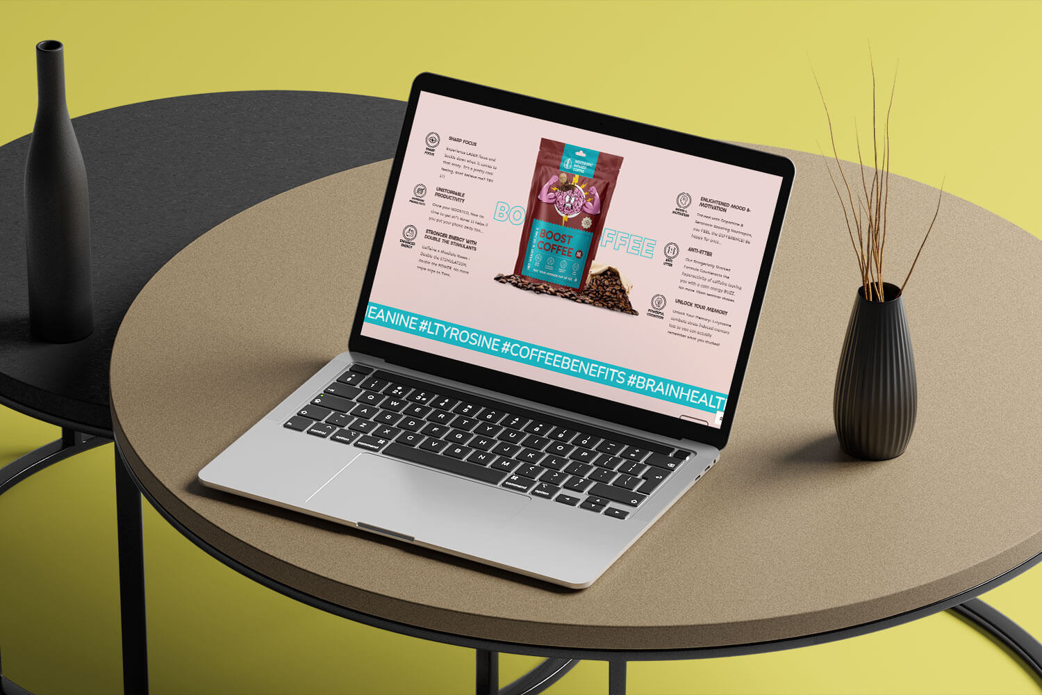
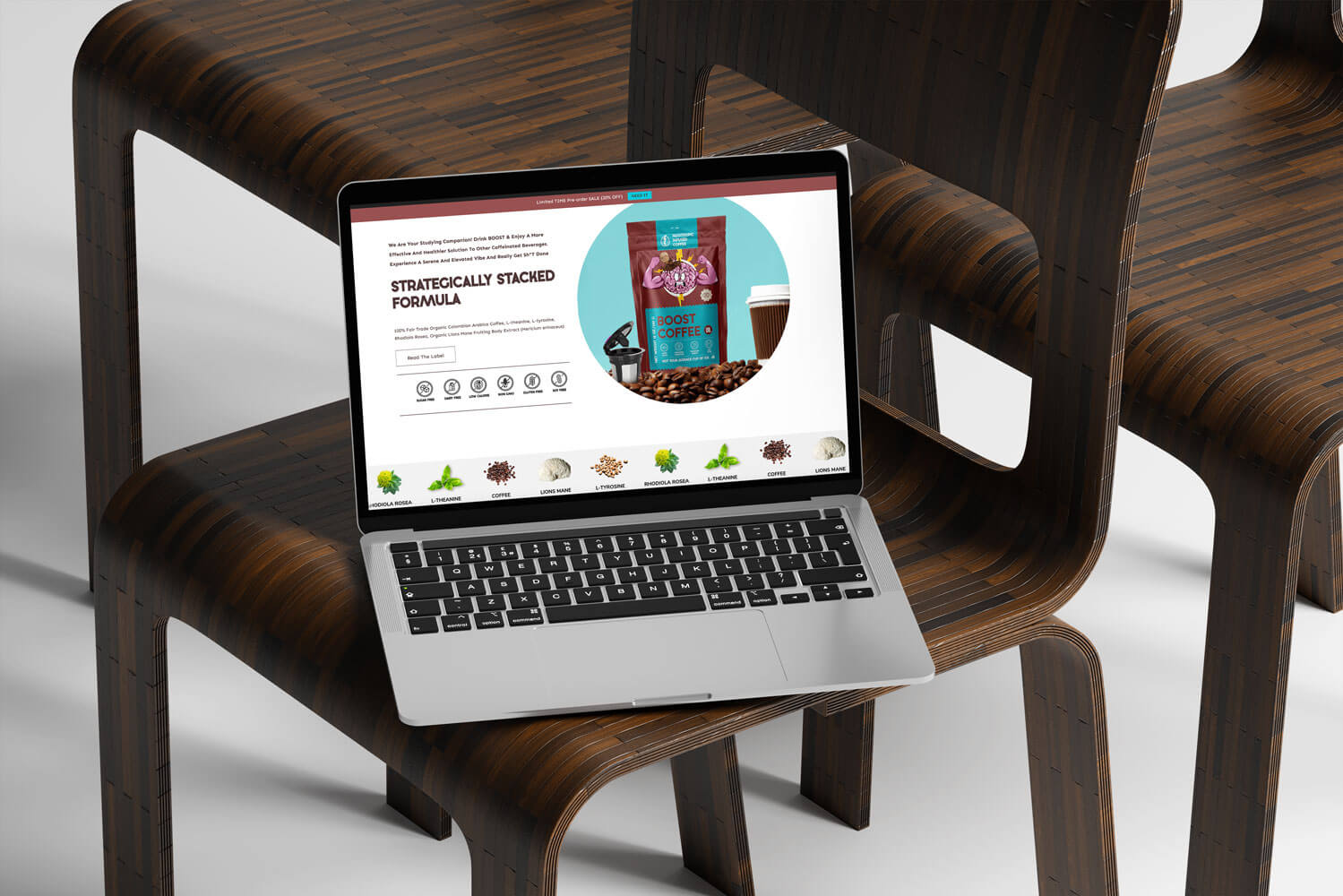
The solution was to use a brain flexing illustration as the focal point of the design. This image was chosen to symbolize mental strength and agility, directly tying into the nootropic benefits of the coffee. The design also incorporates clean, bold typography and a color scheme that suggests energy and vitality, reinforcing the product’s health benefits. The result is a package that not only catches the eye but also clearly communicates the core message of Boost Coffee.

The brain flexing illustration needed to be prominent without overwhelming other essential information on the package and the website. We addressed this by carefully considering the layout and hierarchy of information, ensuring that the visual elements supported rather than overshadowed the product’s benefits.
Boost Coffee
Web Development & Design: Extending the Brand Message Online
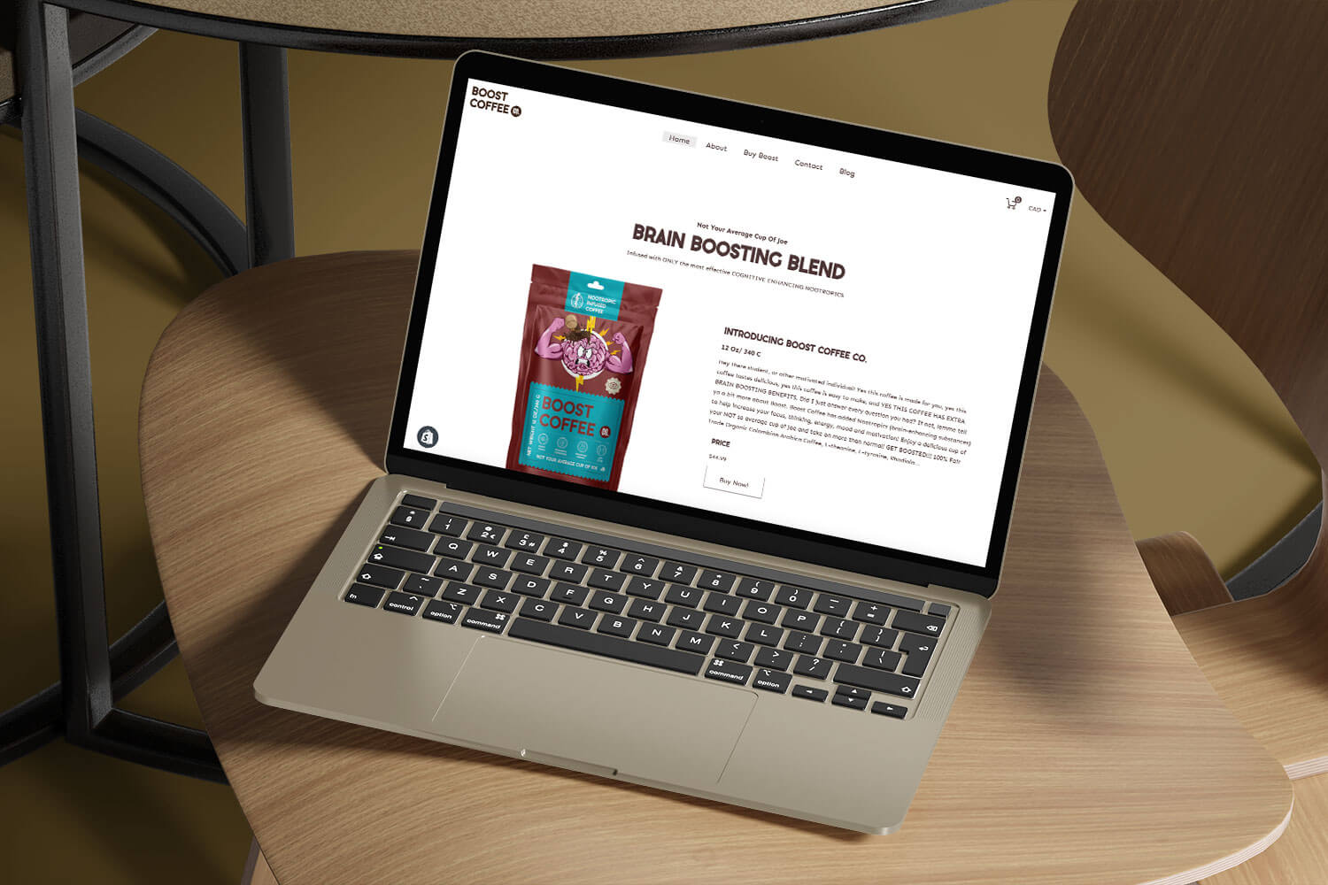
The website for Boost Coffee needed to extend the brand’s message into the digital space, offering users an experience that was as energizing and clear as the coffee itself. Our goal was to create a site that was visually aligned with the packaging while also providing a smooth, intuitive user journey.
The design process began with a focus on user experience, ensuring that the site would be easy to navigate while effectively showcasing the product’s benefits. We incorporated the brain flexing motif into the website’s design elements, creating a cohesive brand experience from the package to the digital interface. The color palette and typography from the packaging were also carried over, ensuring brand consistency across all touchpoints.
Services & Strategy
Portfolio
Other Pages


