The Challenge
While the studio’s classes and programs were thriving, its digital presence no longer matched the energy, professionalism, and innovation of the in-person experience.
The old website provided information about programs and camps, but it lacked the seamless functionality that modern parents expect when enrolling their children.


Navigation was outdated, visuals didn’t fully capture the vibrant spirit of the studio, and parents had to rely on phone calls or email chains to complete registrations — slowing down enrollment and creating extra administrative work.
It was time to give Dancers Burlington a website that not only reflected its artistry, but also supported growth and simplified operations.
Dancers Burlington
Brand Development
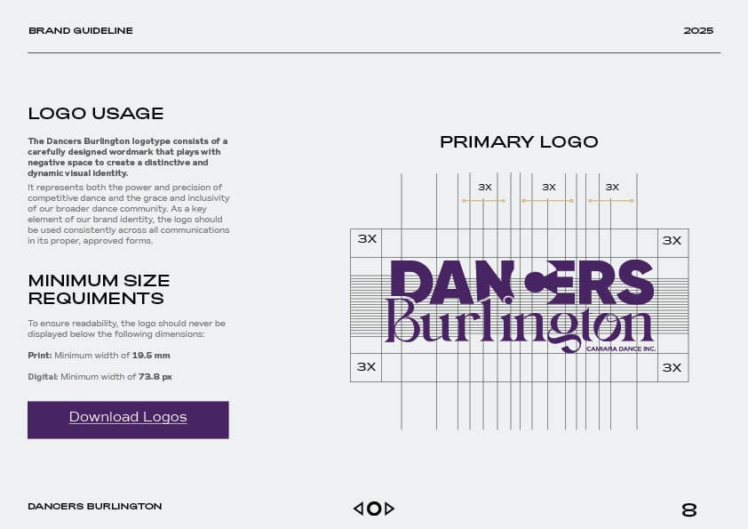
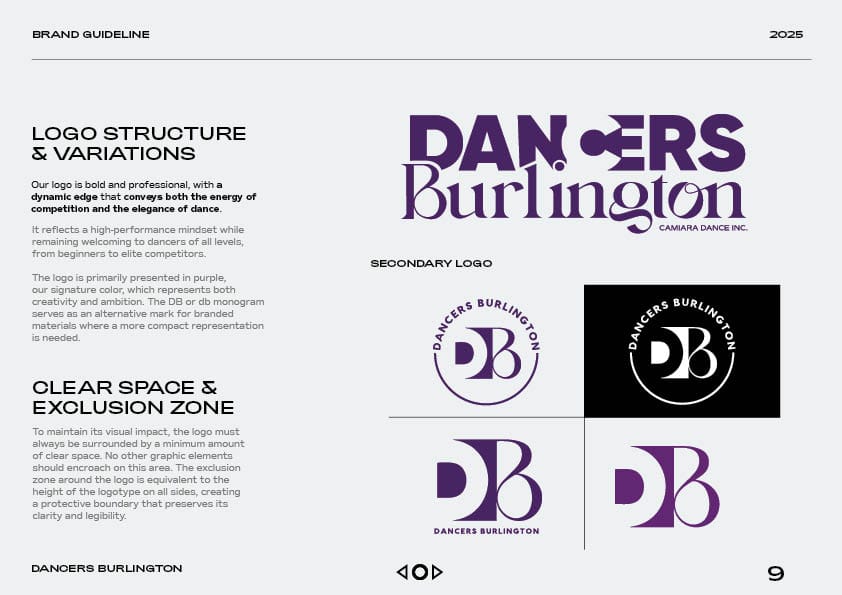
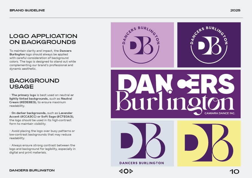
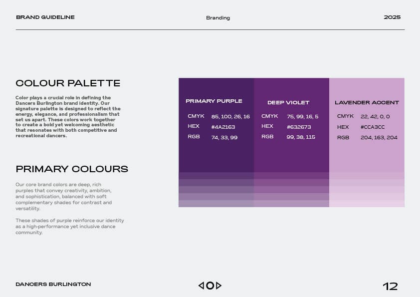
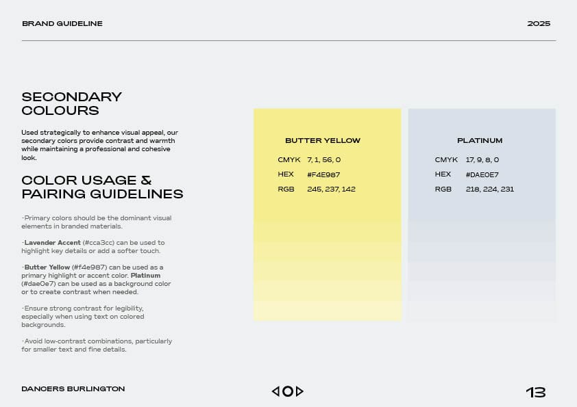
Refined Color Palette: We retained Dancers Burlington’s signature purple to honor brand recognition, but elevated it to a richer, more vibrant shade. To expand versatility across the site, we introduced complementary purple tones along with two new accent colors — a sophisticated gray and a lively yellow — creating a balanced palette that conveys both professionalism and energy.
Modernized Visual Identity: Updated typography and design elements to feel contemporary yet approachable, with graphics inspired by movement and rhythm.
Community Connection: Reinforced Dancers Burlington’s reputation as a trusted, long-standing part of the Burlington community while presenting the brand with a polished, future-focused look.

Discovery & Strategy Phase
The discovery and strategy phase began with an in-depth exploration of the Dancers Burlington brand, its programs, and the community it serves. We analyzed the studio’s recreational, part-time, and elite offerings, gaining insight into the needs of both dancers and their families, as well as the competitive landscape in Burlington.
Workshops and interviews with staff and parents helped us understand pain points, enrollment behaviors, and the aspects of the in-person experience that mattered most. This research informed a comprehensive strategy focused on modernizing the brand’s digital presence while maintaining its core values of discipline, creativity, and community.
Key strategic decisions included refining the visual identity to balance playful energy with professionalism, designing a site structure that guided parents intuitively from program discovery to enrollment, and prioritizing features that would reduce administrative burden and enhance engagement. By combining these insights with a forward-looking design and technology plan, we laid the groundwork for a digital experience that would reflect the excitement of dance while supporting families efficiently and effectively.
Design Concept & Development Phase
The website functionality was completely reimagined to create a dynamic, engaging experience for visitors. Interactive features, including hover effects, clickable modules, and other dynamic elements, encourage exploration and make the site feel alive, while smooth animated scroll movements guide users through content, highlighting key programs and events and enhancing the overall flow.
The layout and design were fully reframed to integrate the refreshed brand identity, combining richer purples, gray and yellow accents, clean typography, and movement-inspired visuals into an intuitive and visually compelling structure. A seamless parent portal allows families to register children for trimesters, camps, or workshops directly online, eliminating manual forms and streamlining enrollment. Built with a mobile-first approach, the site delivers flawless browsing and registration across all devices, and dedicated camp and event pages showcase seasonal programs with weekly schedules, age groups, and direct registration links, bringing the full experience to life online.


Services & Strategy
Portfolio
Other Pages
![]()
![]()
![]()
![]()

![]()
![]()
![]()
![]()
![]()
![]()
![]()


")

")


